2019
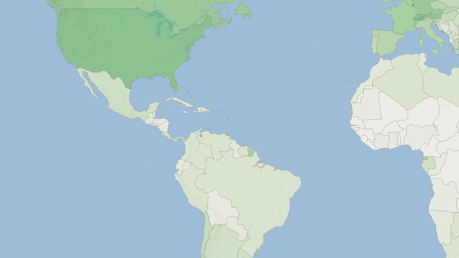
In this tutorial, you will begin working with a vector layer of international boundaries. By the end of this tutorial you should be able to create a map that looks like this:
From the #datasets thread in Slack, download the country borders folder (“ne_50m_admin_0_countries”). Unzip it. Copy and paste this folder into a logical folder (i.e. Documents/QGIS/countries).
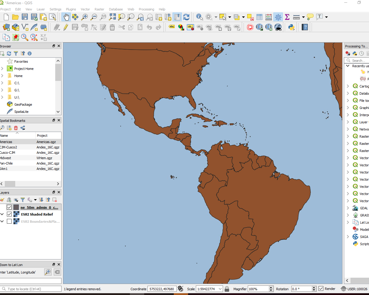
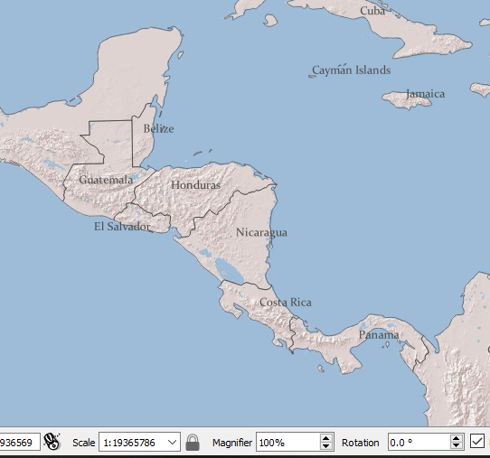
You should now see the new countries layer in your QGIS project. If you cannot see it on the map, take a look at the Layers panel to make sure it is on top. If not use the up-arrow symbol to move your new countries layer to the top of the list. Your map view should now look something like this:
To view the attributes (data fields / variables and their values) for the new countries layer, right-click the countries map layer and select Open Attribute Table. Examine what data is available for each country in this geospatial dataset.
With the Attribute table for the Countries shapefile open, click the pencil to enter Edit Mode.
Next, select the New Field symbol (with a small yellow star). Name the new field “gdppc” (for GDP per capita) and fill out the rest of the fields for the attribute as follows:
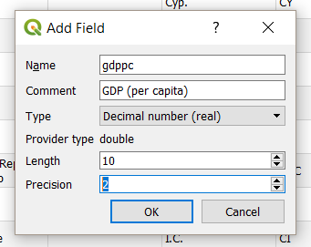
For real numbers, length is the maximum length of characters and precision is the number of decimals. For example, if you choose a field length of 10 and a field precision of 3, it means you have 6 digits before the dot, then the dot and another 3 digits for the precision.
press OK
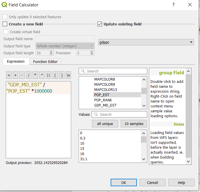
Select your new “gdppc” column and select the field calculator symbol (looks like an abacus). Then fill out the Field Calculator as follows:
Now that we have created a new per capita GDP attribute, we want to display this data on our map. We can do so by doing the following:
Let’s start by removing the fill color and only preserving the outlines of the countries:
Open the Symbology window for your new layer (right click on the countries layer in the Layer panel –> Properties –> Symbology tab)
From the Fill Style menu select “no brush” to remove the fill.
You may now change the color and width of the country outlines by changing the settings on the stroke style and stroke width menus.
Click Apply when you have finished your changes. Close the window and return to your map to see the results.
First, we want to add labels to our countries.
Open the Symbology window again for the countries layer.
Select the Labels tab.
From the drop-down menu select single labels.
We need to choose the variable from the Countries shapefile dataset to display as the label. In this case we will choose “Admin” from the Label with menu.
Choose an appropriate font, font size, and font color to display your labels. Click Apply when done to view the results.
Close the Symbology window to see the results.
Second, let’s change the settings of the labels so they only appear when zoomed in beyond a certain point. To do so, we must do the following:
Open the Symbology window again for the Countries layer.
Open the Labels tab.
Select Rendering from the menu of options
Enable Scale dependent visibility. In the zoom out box (magnifying glass with minus ‘-’) type “1:10000000” (1 to 10 million)
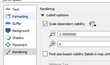
Select OK.
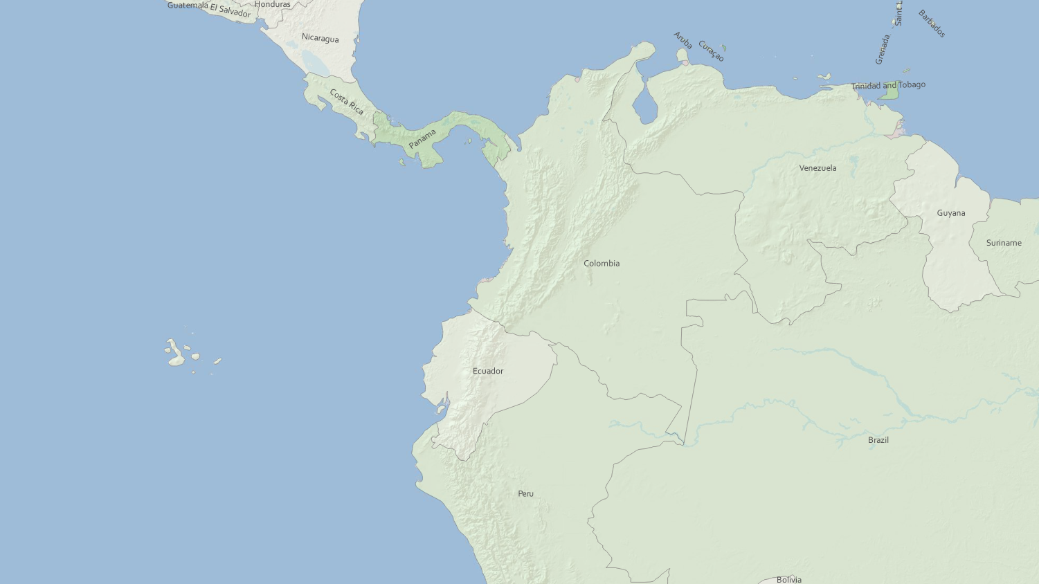
Review the map now by zooming in and out to different scales. You should not be able to see the country labels until you have zoomed in to 1:10,000,000. You can see the scale at the bottom of the map window.
In addition, you may want to change the placement of labels. From the same Labels tab, click on Placement in the center menu. I used the Free (slow) selection which allowed for the placement of labels on diagonals, among other things. Choose the setting you prefer.
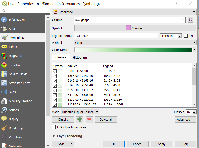
For the Countries layer, open the Symbology tab in the Properties window.
Fill out the settings as follows:
In the top menu, select Graduated.
Select a monochrome color ramp (i.e. “Greens” or “Reds”)
Experiment with different ways to assign class breaks. For example, you can choose between different modes of class breaks (Equal Interval, Quantile, Natural Breaks, Pretty Breaks, etc.) and different numbers of classes (click here for more on data classification methods). You may also view the histograms of this data (click load values to load histograms) to manually set class breaks.
To increase the transparency of your top map layer (GDP, per capita) in order to also view the ESRI shaded relief layer, open the Symbology window (remember, to do so, right-click the map layer, select Properties –> symbology tab).
Select the arrow next to Layer rendering in the symbology window. Experiment with different opacity levels (opacity is the inverse of transparency; 70% transparent = 30% opaque) until finding a setting that still clearly shows global differences in GDP yet also allows some of the relief map layer to appear beneath. Your final result should look something like the maps at the top of the page (but with your choice of colors / transparency / label settings).
Per capita GDP is an indicator of the prosperity of an economy. Thus, much of this map may not be a surprise. North America and Europe are relatively prosperous and Africa is not (according to this measure). But, do you notice any patterns that surprise you?
After completing your new map of global GDP, per capita, export the map (Project–>Import/Export–>Export Map to Image). Submit this to your instructor.