Visualizing Data (within and beyond Python)

Jeremy M. Mikecz

2019

498 Home Syllabus Schedule Mikecz Home Tutorials

To visualize quantitative data within Python, you have several options, including:

For an introduction to these different methods, click here.

You may also choose to export your data from Python and use other tools to visualize it. One good, free, online application is rawgraphs.

Not sure which type of visualization to create? Some useful guides are available at the Data Visualization Catalogue or the Depict Data Studio, both of which were discussed in Cairo’s The Truthful Art, pp. 125 - 134.

Here, we will review some methods for creating a few basic data visualizations in Python as well as a brief explanation how to export a Pandas dataframe and import it into rawgraphs.

Time-Series Line Graphs

  1. Begin with a dataframe that only has one variable column in addition to one column each for the country and date. To subset out these columns, you can use the following line of code:

    urbpop=df[['country','date','pcturb']] #urbpop just keeps 3 columns from the "df" dataframe: country, date, and pcturb.
    
  2. Take a look at this dataframe. Notice it is a “long” dataframe in which each year and country receives its own row. We want to convert this dataframe into a “wide” dataframe. We want each line in our time-series linegraph to have its own column in the dataset. In this case we want each country to have its own line in the plot and therefore column in the dataframe. That can be done with the following code:

    urbpopwide=urbpop.pivot(index='date',columns='country',values='pcturb')
    #the arguments to the "pivot" function do the following
    ## assigns the column "date" as the index 
    ## converts country data from rows to columns
    ## applies this transformation to the 'pcturb' variable.
  3. Take a look at how this new dataframe looks now. If done right, each country should have its own column.

  4. To create a time-series line graph from this dataframe, now we just need one more line of code:

    urbpopwide.plot.line(title='Percent of Total Population living in Urban Areas')
  5. The resulting image should look something like this: (note it will appear on a separate window outside Spyder)

    Python Pandas time-series line graph
    Python Pandas time-series line graph
  6. In summary, three lines of code converted your dataframe into a very clear line graph:

    urbpop=df[['country','date','pcturb']] 
    urbpopwide=urbpop.pivot(index='date',columns='country',values='pcturb')
    urbpopwide.plot.line(title='Percent of Total Population living in Urban Areas')

Scatter Plots

…in pandas

  1. To create a simple scatterplot graph, you can modify and use the following code:

    # create a subset with only data for one year, 2016
    df2016=df[df['date']==2016] 
    
    # using the existing variable / column "popLgstCity" which records the percent of the country's population in its largest city, we will create a new column ( 'popLgstint') that converts that percentage (i.e. 41.452%) to an integer (i.e. 41%).
    df2016['popLgstint']=df2016['popLgstCity'].astype('int32')
    
    #create a scatter plot setting 'pcturb' as your x value, 'totalpop' as your y value, and using the percent of the total population living in the country's largest city as the size of each point (with each multiplied by 5 to make them more visible).
    df2016.plot.scatter(x='pcturb',y='totalpop',s=5*df2016['popLgstint'].values,title='Scatter Plot: Percent of Population living in an Urban Area vs. Total Population')
  2. My resulting plots looks like this:

Pandas Scatter 2016
Pandas Scatter 2016

Besides showing some linear relationship between a country’s economy and the life expectancy of its people, this chart is not very useful. What happens when we plot all years availabe in the WB dataset?

Pandas Scatter
Pandas Scatter

We do see some more stark patterns here. What are they? Without being to identify each country and year, it is impossible to make any conclusions with confidence.

We can use color to identify countries. Doing so in matplotlib/pandas is complicated. So let’s try another method….

… in ggplot

  1. As it is complicated to use Pandas / matplotlib to do more complicated things, like setting a different color for each point, I suggest trying either the ggplot or seaborn packages.

    ggplot(aes(x='pcturb',y='totalpop',color='country',size='popLgst_x5'),data=urbregs2016) +\
        geom_point()
  2. The resulting graph is here:

ggplot scatter
ggplot scatter

Now we can see some really clear patterns.

Note, time is not explicitly shown in this graph. Nonetheless, for some of these countries, where the data is found in a roughly linear pattern, we can probably assume the data shows a linear trend over time. For countries such as Venezuela and Argentina, the pattern over time is much less clear. Therefore we need to find a way to represent time on our graph.

… an interactive plot in plotly

  1. Plotly is a Python package for that allows you to make “interactive, publication-quality graphs online.” To work with plotly first you need to open a free account on plotly’s webpage, install plotly on your computer, and then set up your “credentials” to link your Python code with plotly’s online app. Follow the instructions here to do this.

  2. Creating an interactive scatter plot or “bubble chart” (scatter plots with the size of each marker representing an additional variable) requires much more code than that needed for pandas/matplotlib, and ggplot. Fortunately, if you can find some existing code that creates the specific type of data visualization you want to create, you can simply copy the code and then plug in your data into the code. I borrowed the code below from Plotly’s tutorial on bubble charts and then modified it to display my own data.

  3. But, first, here is what my plot looks like:

plotly graph
  1. Still needs a lot of work. For example, the range of years in the life expectancy graph should be narrowed to better show the important improvements residents of these countries have experienced in health and life expectancy.

  2. Here is the code:

    import wbdata
    import pandas as pd, numpy as np
    import os
    
    import plotly.plotly as py  
    import plotly.graph_objs as go
    
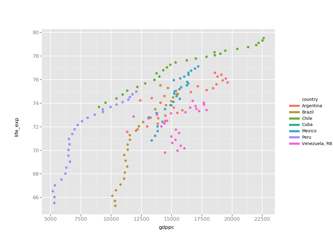
    lqregs=pd.read_csv('lifeQ_regs.csv') #imports my dataset of Quality of Life data for continents / regions (life expectancy, gdp, literacy, net migration, malnourishment, etc.)
    lqLA=pd.read_csv('lifeQ_LatAm.csv') # same as above but with Latin American countries
    lqLA['text']=lqLA['country']+' ' +lqLA['date'].map(str)  # creates a new variable that combining the country and date into one variable (i.e. "Argentina 1991") for ease of display in my chart
    
    lqLA['tpop_millions']=lqLA['totalpop']/1000000 #creates a new variable recording total population in millions
    lqLA2=lqLA.dropna(subset=['tpop_millions']) #removes all instances (rows) missing total population data
    
    #not sure what this does, but I plugged in the name of my dataframe ("lqLA2") and the variable I want to use to set the size of each point ("tpop_millions")
    sizeref = 2.*max(lqLA2['tpop_millions'])/(100**2)
    
    # in plotly we need to separate code for each country if we want to display them with different colors.
    # for trace0 I modified all the code to call the dataframe and variables I am using. Then I set the country to 'Argentina'
    # I also set the  color for  Argentina using [rgb codes](https://www.rapidtables.com/web/color/RGB_Color.html).
    trace0 = go.Scatter(
        x=lqLA2['gdppc'][lqLA2['country'] == 'Argentina'],
        y=lqLA2['life_exp'][lqLA2['country'] == 'Argentina'],
        mode='markers',
        name='Argentina',
        text=lqLA2['text'][lqLA2['country'] == 'Argentina'],
        marker=dict(
            color='rgb(93, 164, 214)',
            symbol='circle',
            sizemode='area',
            sizeref=sizeref,
            size=lqLA2['tpop_millions'][lqLA2['country'] == 'Argentina']/4,
            line=dict(
                width=2
            ),
        )
    )
    
    #then for traces 1-6 I just copied my modified code from trace0, only needing to modify the country name (5x each) and the color for each trace.
    trace1 = go.Scatter(
        x=lqLA2['gdppc'][lqLA2['country'] == 'Brazil'],
        y=lqLA2['life_exp'][lqLA2['country'] == 'Brazil'],
        mode='markers',
        name='Brazil',
        text=lqLA2['text'][lqLA2['country'] == 'Brazil'],
        marker=dict(
            color='rgb(255, 144, 14)',
            symbol='circle',
            sizemode='area',
            sizeref=sizeref,
            size=lqLA2['tpop_millions'][lqLA2['country'] == 'Brazil']/4,
            line=dict(
                width=2
            ),
        )
    )
    
    trace2 = go.Scatter(
        x=lqLA2['gdppc'][lqLA2['country'] == 'Chile'],
        y=lqLA2['life_exp'][lqLA2['country'] == 'Chile'],
        mode='markers',
        name='Chile',
        text=lqLA2['text'][lqLA2['country'] == 'Chile'],
        marker=dict(
            color='rgb(44, 160, 101)',
            symbol='circle',
            sizemode='area',
            sizeref=sizeref,
            size=lqLA2['tpop_millions'][lqLA2['country'] == 'Chile']/4,
            line=dict(
                width=2
            ),
        )
    )
    
    
    trace3 = go.Scatter(
        x=lqLA2['gdppc'][lqLA2['country'] == 'Cuba'],
        y=lqLA2['life_exp'][lqLA2['country'] == 'Cuba'],
        mode='markers',
        name='Cuba',
        text=lqLA2['text'][lqLA2['country'] == 'Cuba'],
        marker=dict(
            color='rgb(70, 40, 171)',
            symbol='circle',
            sizemode='area',
            sizeref=sizeref,
            size=lqLA2['tpop_millions'][lqLA2['country'] == 'Cuba']/4,
            line=dict(
                width=2
            ),
        )
    )
    
    
    trace4 = go.Scatter(
        x=lqLA2['gdppc'][lqLA2['country'] == 'Mexico'],
        y=lqLA2['life_exp'][lqLA2['country'] == 'Mexico'],
        mode='markers',
        name='Mexico',
        text=lqLA2['text'][lqLA2['country'] == 'Mexico'],
        marker=dict(
            color='rgb(120, 240, 20)',
            symbol='circle',
            sizemode='area',
            sizeref=sizeref,
            size=lqLA2['tpop_millions'][lqLA2['country'] == 'Mexico']/4,
            line=dict(
                width=2
            ),
        )
    )
    
    
    trace5 = go.Scatter(
        x=lqLA2['gdppc'][lqLA2['country'] == 'Peru'],
        y=lqLA2['life_exp'][lqLA2['country'] == 'Peru'],
        mode='markers',
        name='Peru',
        text=lqLA2['text'][lqLA2['country'] == 'Peru'],
        marker=dict(
            color='rgb(180, 100, 245)',
            symbol='circle',
            sizemode='area',
            sizeref=sizeref,
            size=lqLA2['tpop_millions'][lqLA2['country'] == 'Peru']/4,
            line=dict(
                width=2
            ),
        )
    )
    
    
    trace6 = go.Scatter(
        x=lqLA2['gdppc'][lqLA2['country'] == 'Venezuela, RB'],
        y=lqLA2['life_exp'][lqLA2['country'] == 'Venezuela, RB'],
        mode='markers',
        name='Venezuela, RB',
        text=lqLA2['text'][lqLA2['country'] == 'Venezuela, RB'],
        marker=dict(
            color='rgb(240, 40, 160)',
            symbol='circle',
            sizemode='area',
            sizeref=sizeref,
            size=lqLA2['tpop_millions'][lqLA2['country'] == 'Venezuela, RB']/4,
            line=dict(
                width=2
            ),
        )
    )


    #combines all the traces into one dataset
    data = [trace0, trace1, trace2, trace3, trace4, trace5, trace6]
    # sets the layout for the grid (axes, labels, color background, etc.)
    layout = go.Layout(
        title='Life Expectancy v. Per Capita GDP',
        xaxis=dict(
            title='GDP per capita',
            gridcolor='rgb(255, 255, 255)',
            zerolinewidth=1,
            ticklen=5,
            gridwidth=2,
        ),
        yaxis=dict(
            title='Life Expectancy (years)',
            gridcolor='rgb(255, 255, 255)',
            zerolinewidth=1,
            ticklen=5,
            gridwidth=2,
        ),
        paper_bgcolor='rgb(243, 243, 243)',
        plot_bgcolor='rgb(243, 243, 243)',
    )
    
    #puts it all together to create the plot.
    fig = go.Figure(data=data, layout=layout)
    url=py.plot(fig, filename='life-expectancy-per-GDP')

… or in the rawgraphs online app

  1. You can copy and paste your dataset into Rawgraphs.

  2. Then choose scatterplot.

  3. Finally, you will need to assign your variables to attributes (x, y, size, color, etc.) of the rawgraph visualization. For example, I chose:

    1. x axis = gdp per capita
    2. y axis = life expectancy
    3. color = country
    4. size = total population
  4. The final result is below. Notice we still have a few problems. The circles located on the axes are the result of null data. That can be fixed easily by returning to python, removing all null values for the relevant columns and then re-exporting our dataset. See the previous tutorial for the code that shows how to remove null values (search for the line of code beginning with “df_haspop”). I think removing this null data will help scale the plot in a more functional and informative way (i.e. beginning the life expectancy at 50 or 60 not 0).

rawgraphs scatter
rawgraphs scatter

and some final editing

  1. After creating and saving your plots, if you want to modify them in anyway (i.e. manually add labels to the rawgraphs chart above) you can try using a vector image editing software program. I recommend the free and open-source Inkscape.